
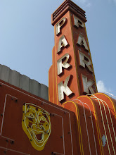
About the Walker Art Center's 2005 Addition
Strangely, my photos from this evening's visit to the Walker Art Center got uploaded in the reverse order, so I'll start at the end of my story. The Walker addition is designed by world famous architecture firm Herzog & de Meuron. They are certainly world class architects and the building from the outside, while controversial, is a welcome modern icon for Minneapolis. I was a little surprised that the fixtures on the bathroom sinks looked like cheapo Home Depot American Standard and wondered if the budget got whacked here? The new walls of this modern art center house the gift store, two large galleries, a bar, restrooms (of course) and a wonderfully long hallway that runs with Hennepin Avenue as well as a seating area that overlooks the very highbrow Kenwood neighborhood.
 The bathroom stalls were so cool that it took two photos to capture the glory. Notice the long doors? In all fairness, most women's restrooms are designed by lesser architects. In most circumstances the typical restroom door closes, and you have to squeeze right up to the toilet to escape the door. Not at the Walker. I cleared the door standing and seated. I also liked the black painted walls and dim lights ... but I think First Avenue had that going on about 20 years ago.
 The feelings the bookstore mustered within me weren't really so different than how I'd felt long ago during a visit to the original location. It's an artsy immersion that makes me want to move right in and play with everything. It's dynamic merchandising. I spent more time here than I did looking at some of the "modern" exhibits. The tall walls full of books and merchandise command attention in a very serene yet explosive fashion. The selection of books is like no other, nor are the gift items. Above, cut outs compose the wandering hallway's ceiling, instead of a solid something. A nice feature.
 Eero is Hero-quality Exhibit
 The new walls of this modern art center house the gift store, two large galleries, a bar, restrooms (of course) and a wonderfully long hallway that runs with Hennepin Avenue as well as a seating area that overlooks the very highbrow Kenwood neighborhood.
 The bathroom stalls were so cool that it took two photos to capture the glory. Notice the long doors? In all fairness, most women's restrooms are designed by lesser architects. In most circumstances the typical restroom door closes, and you have to squeeze right up to the toilet to escape the door. Not at the Walker. I cleared the door standing and seated. I also liked the black painted walls and dim lights ... but I think First Avenue had that going on about 20 years ago.
 The feelings the bookstore mustered within me weren't really so different than how I'd felt long ago during a visit to the original location. It's an artsy immersion that makes me want to move right in and play with everything. It's dynamic merchandising. I spent more time here than I did looking at some of the "modern" exhibits. The tall walls full of books and merchandise command attention in a very serene yet explosive fashion. The selection of books is like no other, nor are the gift items. Above, cut outs compose the wandering hallway's ceiling, instead of a solid something. A nice feature.
 Eero is Hero-quality Exhibit
 This Eero Saarinen exhibit was part of the reason for my visit. I'd been to the other half of this show at Minneapolis Institute of Arts, last weekend. Naturally, I needed to see the whole thing. I must say, it was an exceptional idea to share the collection among two of the leading Minneapolis arts destinations. (Also, I love the MIA).
The entire exhibit at the Walker was outstanding. The curators really understood how to share the photos, drawings and furnishings. The arrangement of all was very clean and easy to follow. It had flow and interest. The colors, orange, white and black worked so well together. The MIA's space was about one sixth of the Walker's, but exceptionally executed as well. If you like architecture and furniture design spanning from the late 40s through the early 70s, this is totally worth your time.
The Rest of the Exhibit Galleries
To be clear, my issue with the Walker isn't that I don't like modern art. I felt that the Walker was trying too hard to have obscure collections on view overall. I am not covering the content of those collections here, by the way. I am all for the Walker. We need the Walker. But we also need the Walker to have cohesive collections on view that represent the full range of Modern Art.
The curatorial work was so minimalist that it was difficult to read the small font and any type of overall message beyond an artist's statement was painfully absent. It was more like a flea market of obscurity, waving under the banner of "modern". By contrast, the programming, films and lectures that the Walker offers seem rich. What's on display doesn't come close. I would say that the Walker does a great job of marketing, but it needs to work on the gallery content. The marketing got me there, but without the cool building, gift store, and Saarinen exhbit .. (and no I'm not including the restrooms here), I'm sure I wouldn't go back too soon.


1 comment:
Interesting
Post a Comment